CSS基础
1、什么是CSS
如何学习
- CSS是什么
- CSS怎么用(快速入门)
- CSS选择器(重点+难点)
- 美化网页(文字,阴影,超链接,列表,渐变…)
- 盒子模型
- 浮动
- 定位
- 网页动画(特效)
1.1 什么是CSS
Cascading Style Sheet 层叠级联样式表
CSS:表现(美化网页)
字体,颜色,边距,宽度,背景图片,网页定位,网页浮动…
1.2 发展史
CSS1.0
CSS2.0 DIV(块) + CSS,THML与CSS结构分离的思想,网页变得简单,SEO
CSS2.1 浮动,定位
CSS3.0 圆角,阴影,动画… 浏览器兼容性~
1.3 快速入门
基本入门
1
2
3
4
5
6
7
8
9
10
11
12
13
14
15
16
17
18
19
20
21
22
23
24
25
26
27
| <!DOCTYPE html>
<html lang="en">
<head>
<meta charset="UTF-8">
<title>Title</title>
<style>
h1{
color: red;
}
</style>
</head>
<body>
<h1>我是标题</h1>
</body>
</html>
|
CSS的优势:
- 内容和表现分离
- 网页结构表现同意,可以实现复用
- 样式十分的丰富
- 建议使用独立于html的css文件
- 利用SEO,容易被搜索引擎收录
1.4 CSS的3种导入方式
1
2
3
4
5
6
7
8
9
10
11
12
13
14
15
16
17
18
19
20
21
22
23
24
25
| <!DOCTYPE html>
<html lang="en">
<head>
<meta charset="UTF-8">
<title>Title</title>
<style>
h1{
color: green;
}
</style>
<link rel="stylesheet" href="demo02.css">
</head>
<body>
<h1 style="color: red">我是标题</h1>
</body>
</html>
|
扩展:外部样式两种写法
1
2
|
<link rel="stylesheet" href="demo02.css">
|
1
2
3
4
|
<style>
@import url("demo02.css");
</style>
|
2、选择器
作用:选择页面上的某一个或者某一类元素
2.1 基本选择器
- 标签选择器:选择一类标签 {}
1
2
3
4
5
6
7
8
9
10
11
12
13
14
15
16
17
18
19
20
21
22
23
| <meta charset="UTF-8">
<title>Title</title>
<style>
h1{
color: #09eec5;
background: burlywood;
border-radius: 5px;
}
p{
font-size: 80px;
}
</style>
</head>
<body>
<h1>学CSS</h1>
<h1>学CSS</h1>
<p>段落</p>
</body>
</html>
|
- 类选择器 class:选择所有class属性一致的标签,跨标签 .类名{}
1
2
3
4
5
6
7
8
9
10
11
12
13
14
15
16
17
18
19
20
21
22
23
24
25
26
27
28
29
| <!DOCTYPE html>
<html lang="en">
<head>
<meta charset="UTF-8">
<title>Title</title>
<style>
/*类选择器的格式 .class的名称{}
好处,可以多个标签归类,是同一个class,可以复用
*/
.qinjiang{
color: red;
}
.kuang{
color: darkorange;
}
</style>
</head>
<body>
<h1 class="qinjiang">标题1</h1>
<h1 class="kuang">标题2</h1>
<h1 class="kuang">标题3</h1>
<p class="kuang">P标签</p>
</body>
</html>
|
- id选择器:全局唯一! #id名{}
1
2
3
4
5
6
7
8
9
10
11
12
13
14
15
16
17
18
19
20
21
22
23
24
25
26
27
28
29
30
31
32
33
34
35
| <!DOCTYPE html>
<html lang="en">
<head>
<meta charset="UTF-8">
<title>Title</title>
<style>
/*
id选择器 :id不许保证全局唯一!
#id名称{}
优先级:
不遵循就近原则,固定的
id选择器 > class 选择器 > 标签选择器
*/
#i1{
color: plum;
}
.style1{
color: green;
}
h1{
color: red;
}
</style>
</head>
<body>
<h1 id="i1" class="style1">标题1</h1>
<h1 class="style1">标题2</h1>
<h1 class="style1">标题3</h1>
<h1>标题4</h1>
<h1>标题5</h1>
</body>
</html>
|
优先级:id选择器 > class 选择器 > 标签选择器
2.2 层次选择器
- 后代选择器:在某个元素的后面
1
2
3
4
|
body p{
background: burlywood;
}
|
- 子选择器:一代
1
2
3
4
|
body>p{
background: #09eec5;
}
|
- 相邻兄弟选择器:同辈
1
2
3
4
|
.active +p{
background: brown;
}
|
- 通用选择器
1
2
3
4
|
.active ~p{
background: #07f637;
}
|
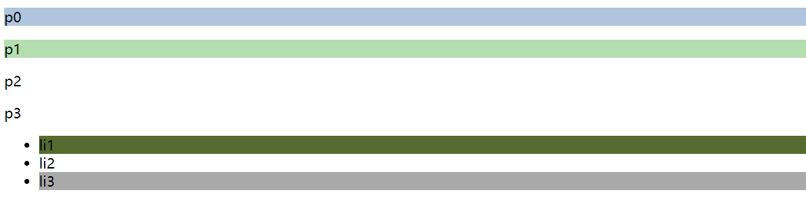
2.3 结构伪类选择器
伪类:条件
1
2
3
4
5
6
7
8
9
10
11
12
13
14
15
16
17
18
19
20
|
ul li:first-child{
background: darkolivegreen;
}
ul li:last-child{
background: darkgray;
}
p:nth-child(1){
background: lightsteelblue;
}
p:nth-of-type(2){
background: #b5deb0;
}
|
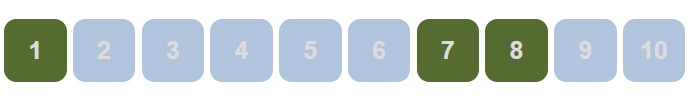
2.4 属性选择器
1
2
3
4
5
6
7
8
9
10
11
12
13
14
15
16
17
18
19
20
21
22
23
24
25
26
27
28
29
30
31
32
33
34
35
36
37
38
39
40
41
42
43
44
45
46
47
48
49
50
51
52
53
54
55
56
57
58
59
60
61
62
63
64
65
66
67
| <!DOCTYPE html>
<html lang="en">
<head>
<meta charset="UTF-8">
<title>Title</title>
<style>
.demo a{
float: left;
display: block;
height: 50px;
width: 50px;
border-radius: 10px;
background: lightsteelblue;
text-align: center;
color: gainsboro;
text-decoration: none;
margin-right: 5px;
font: bold 20px/50px Arial;
}
/*属性名,属性名 = 属性值(正则)
= 绝对等于
*= 包含这个元素
*/
a[href^=http]{
background: darkolivegreen;
}
a[href$=pdf]{
background: darkolivegreen;
}
</style>
</head>
<body>
<p class="demo">
<a href="http://www.baidu.com" class="link item first" id="first">1</a>
<a href="" class="link item active" target="_blank" title="test">2</a>
<a href="iamges/123.thml" class="link item">3</a>
<a href="iamges/123.png" class="link item">4</a>
<a href="iamges/123.jpg">5</a>
<a href="abc">6</a>
<a href="/a.pdf">7</a>
<a href="/abc.pdf">8</a>
<a href="abc.doc">9</a>
<a href="abcd.doc" class="link item last">10</a>
</p>
</body>
</html>
|
3、美化页面元素
3.1 为什么要梅花网页
- 有效传递页面信息
- 美化网页,页面漂亮,才能吸引用户
- 凸显页面主题
- 提高用户体验
span标签:重点要突出的字,使用span套起来
1
2
3
4
5
6
7
8
9
10
11
12
13
14
15
16
17
18
| <!DOCTYPE html>
<html lang="en">
<head>
<meta charset="UTF-8">
<title>Title</title>
<style>
#title1{
font-size: 50px;
}
</style>
</head>
<body>
欢迎学习<span id="title1">JAVA</span>
</body>
</html>
|
3.2 字体样式
1
2
3
4
5
6
7
8
9
10
11
12
13
14
15
16
17
18
| <!DOCTYPE html>
<html lang="en">
<head>
<meta charset="UTF-8">
<title>Title</title>
<style>
p{
font: oblique bolder 22px "楷体";
}
</style>
</head>
<body>
<p>雷军,男,汉族,1969年12月16日出生于湖北省仙桃市,无党派,大学学历,理学学士学位,高级工程师。 [1] 中国大陆著名天使投资人。</p>
</body>
</html>
|
3.3 文本样式
- 颜色 color rgb rgba
- 文本对齐方式 text-align = center
- 首行缩进 text-indent:2em
- 行高 line-height: 单行文字上下居中 line-height = height
- 装饰 text-decoration
- 文本图片水平对齐 vertical-align: middle
1
2
3
4
5
6
7
8
9
10
11
12
13
14
15
16
17
18
19
20
21
22
23
24
25
26
27
28
29
30
31
32
33
34
35
36
37
38
39
40
41
42
43
44
45
46
47
48
49
50
51
52
53
54
55
56
57
58
59
60
61
62
63
64
65
66
67
68
69
70
71
| <!DOCTYPE html>
<html lang="en">
<head>
<meta charset="UTF-8">
<title>Title</title>
<style>
h1{
color: rgba(0,255,255,0.5);
text-align: center;
}
.p1{
text-indent: 2em;
}
.p3{
background: lightsteelblue;
height: 300px;
line-height: 300px;
}
.l1{
text-decoration: underline;
}
.l2{
text-decoration: line-through;
}
.l3{
text-decoration: overline;
}
/*
水平对齐~参照物, a,b
*/
img,span{
vertical-align: middle;
}
a{
text-decoration: none;
}
</style>
</head>
<body>
<a href="">123</a>
<p>
<img src="../images/img.png" alt="">
<span>asdasfagadfhs</span>
</p>
<p class="l1">123123</p>
<p class="l2">123123</p>
<p class="l3">123123</p>
<h1>介绍</h1>
<p class="p1">「享延保、碎屏保8折优惠;赠小米移动流量卡;赠多看阅读VIP季卡;享特惠加价购」</p>
<p>一亿像素夜景相机 / 国内首发骁龙 750G处理器 / 6.67''小孔径全面屏 / 120Hz六档变速高刷屏 / 全场景AI四摄 / 线性马达 / 4820mAh+33W闪充 / 立体声双扬声器 / 多功能NFC</p>
<p class="p3">Xiaomi, a global company producing quality products at honest pricing.</p>
</body>
</html>
|
3.4 阴影
1
2
3
4
|
#university{
text-shadow: deepskyblue 10px -10px 10px;
}
|
3.5 超链接伪类
正常情况下:a, a:hover
1
2
3
4
5
6
7
8
9
10
11
12
13
|
a:hover{
color: orange;
font-size: 50px;
}
a:active{
color: brown;
}
a:visited{
color: burlywood;
}
|
3.6 列表
1
2
3
4
5
6
7
8
9
10
11
12
13
14
15
16
17
|
ul li{
height: 30px;
list-style: none;
text-indent: 1em;
}
|
3.7 背景
背景颜色
背景图片
1
2
3
4
5
6
7
8
9
10
11
12
13
14
15
16
17
18
| <style>
div{
width: 1000px;
height: 700px;
border: 1px solid red;
background-image: url("IMG_5966.jpg");
}
.div1{
background-repeat: repeat-x;
}
.div2{
background-repeat: repeat-y;
}
.div3{
background-repeat: no-repeat;
}
</style>
|
1
2
3
4
5
6
7
8
| ul li{
height: 30px;
list-style: none;
text-indent: 1em;
background-image: url("img_1.png");
background-repeat: no-repeat;
background-position: 245px 4px;
}
|
3.8 渐变
1
2
| background-color: #0093E9;
background-image: linear-gradient(45deg, #0093E9 0%, #80D0C7 100%);
|
4、盒子模型
4.1 什么是盒子
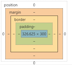
margin:外边距
padding:内边距
border:边框
4.2 边框
1
2
3
4
5
6
7
8
9
10
11
12
13
14
15
16
17
18
19
20
21
22
23
24
25
26
27
28
29
30
31
32
33
| <style>
h2,h1,ul,li,a,body{
margin: 0;
padding: 0;
text-decoration: none;
}
#box{
width: 300px;
border: 1px solid red;
}
h2{
font-size: 16px;
background: #b5deb0;
line-height: 30px;
color: darkslateblue;
}
form{
background: lightsteelblue;
}
div:nth-of-type(1)>input{
border: 3px solid black;
}
div:nth-of-type(2)>input{
border: 3px dashed powderblue;
}
div:nth-of-type(3)>input{
border: 3px dashed darkslateblue;
}
</style>
|
4.3 内外边距
1
2
3
4
5
6
7
8
9
10
11
12
13
14
15
16
17
18
19
20
21
22
23
24
25
26
27
28
29
30
31
32
33
34
35
36
37
38
39
40
41
42
43
44
45
46
47
48
49
50
51
52
53
54
55
56
57
58
59
60
61
62
63
64
65
66
67
| <!DOCTYPE html>
<html lang="en">
<head>
<meta charset="UTF-8">
<title>Title</title>
<style>
h2,h1,ul,li,a,body{
margin: 0;
padding: 0;
text-decoration: none;
}
/*
border:粗细,样式,颜色
*/
#box{
width: 300px;
border: 1px solid red;
margin: 0 auto;
;
}
/*
顺时针旋转
margin: 0
margin: 0 1px
margin: 0 1px 2px 3px
*/
h2{
font-size: 16px;
background: #b5deb0;
line-height: 30px;
color: darkslateblue;
margin: 0 1px 2px 3px;
}
form{
background: lightsteelblue;
}
input{
border: 1px solid black;
}
div:nth-of-type(1){
padding: 10px 2px;
}
</style>
</head>
<body>
<div id="box">
<h2>会员登录</h2>
<form action="#">
<div>
<span>用户名:</span>
<input type="text">
</div>
<div>
<span>密码:</span>
<input type="text">
</div>
<div>
<span>邮箱:</span>
<input type="text">
</div>
</form>
</div>
</body>
</html>
|
盒子的计算方式:你这个元素到底多大?
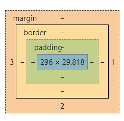
margin+border+padding+内容宽度
4.4 圆角边框
4个角
1
2
3
4
5
6
7
8
9
10
11
12
|
<style>
div{
width: 100px;
height: 100px;
border: 10px solid red;
border-radius: 50px 20px 10px 5px;
}
</style>
|
4.5 盒子阴影
1
2
3
4
5
6
7
8
9
10
11
12
|
<style>
div{
width: 100px;
height: 100px;
border: 10px solid red;
box-shadow: 10px 10px 10px yellow;
margin: 0 auto;
}
</style>
|
5、浮动
5.1 标准文档流
块级元素:独占一行
行内元素:不独占一行
行内元素可以被包围在块级元素中,反之,则不可以
5.2 display
1
2
3
4
5
6
7
8
9
10
11
12
13
14
15
16
17
18
19
20
|
<style>
div{
width: 100px;
height: 100px;
border: 2px solid red;
display: inline;
margin: 0;
}
span{
width: 100px;
height: 100px;
border: 1px solid red;
display: none;
}
</style>
|
这个也是一种实现行内元素排列的方式,但是我们很多情况都是用float
5.3 float
- 左右浮动 float
1
2
3
4
5
| .layer{
border: 1px solide #060;
display: inline-block;
float: right;
}
|
5.4 父级边框塌陷的问题
解决方案:
- 增加父级元素的高度
1
2
3
4
| #father{
border: 1px #000 solid;
height: 800px;
}
|
- 增加一个空的div标签清除浮动
1
2
3
4
5
6
7
| <div class="clear"></div>
.clear{
clear: both;
margin: 0;
padding: 0;
}
|
- overflow
在父级元素中增加一个overflow: hidden;
1
2
3
4
| #father{
border: 1px #000 solid;
overflow: hidden;
}
|
- 父类添加一个伪类:after
1
2
3
4
5
| #father:after{
content: '';
display: block;
clear: both;
}
|
小结:
浮动元素后面增加空div
简单,代码中尽量避免空div
设置父元素的高度
简单,元素假设有了固定的高度,就会被限制
overflow
简单,下拉的一些场景避免使用
父类添加一个伪类:after(推荐)
写法稍微复杂一点,但是没有副作用,推荐使用
5.5 对比
6、定位
6.1 相对定位
1
2
3
4
5
6
7
8
9
10
11
12
13
14
15
16
17
18
19
20
21
22
23
24
25
26
27
28
29
30
31
32
33
34
35
36
37
38
39
40
41
42
43
44
45
46
47
48
49
50
51
52
| <!DOCTYPE html>
<html lang="en">
<head>
<meta charset="UTF-8">
<title>Title</title>
<style>
body{
padding: 20px;
}
div{
margin: 10px;
padding: 5px;
font-size: 12px;
line-height: 25px;
}
#father{
border: 1px solid #666;
padding: 0;
}
#first{
border: 1px dashed #299e4e;
background-color: #299e99;
position: relative;
top: -20px;
left: 20px;
}
#second{
border: 1px dashed #98ac27;
background-color: #98ac99;
}
#third{
border: 1px dashed #722da3;
background-color: #722d99;
position: relative;
bottom: -10px;
right: 20px;
}
</style>
</head>
<body>
<div id="father">
<div id="first">第一个盒子</div>
<div id="second">第二个盒子</div>
<div id="third">第三个盒子</div>
</div>
</body>
</html>
|
相对定位:position: relative;
相对于原来的位置,进行指定的偏移,相对定位的话,它仍然在标准文档流中,原来的位置会被保留
1
2
3
4
| top: -20px;
left: 20px;
bottom: -10px;
right: 20px;
|
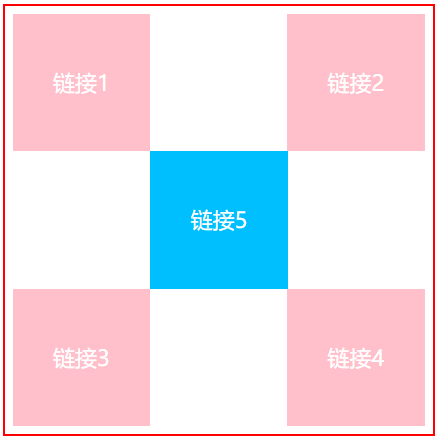
练习:
1
2
3
4
5
6
7
8
9
10
11
12
13
14
15
16
17
18
19
20
21
22
23
24
25
26
27
28
29
30
31
32
33
34
35
36
37
38
39
40
41
42
43
44
45
46
47
48
49
50
51
52
53
54
55
56
57
58
| <!DOCTYPE html>
<html lang="en">
<head>
<meta charset="UTF-8">
<title>Title</title>
<style>
div{
border: 2px solid red;
width: 300px;
height: 300px;
padding: 5px;
}
a {
width: 100px;
height: 100px;
display: inline-block;
background-color: pink;
color: white;
text-decoration: none;
text-align: center;
line-height: 100px;
}
a:hover{
background-color: deepskyblue;
}
#href1{
}
#href2{
position: relative;
left: 95px;
}
#href3{
position: relative;
top: 100px;
}
#href4{
position: relative;
top: 100px;
left: 95px;
}
#href5{
position: relative;
top: -100px;
left: 100px;
}
</style>
</head>
<body>
<div>
<a href="#" id="href1">链接1</a>
<a href="#" id="href2">链接2</a>
<a href="#" id="href3">链接3</a>
<a href="#" id="href4">链接4</a>
<a href="#" id="href5">链接5</a>
</div>
</body>
</html>
|
6.2 绝对定位
定位:基于XXX定位,上下左右
绝对定位:position:absolute;
- 没有父级元素定位的前提下,相对于浏览器定位
- 假设父级元素存在定位,我们通常会相对于父级元素进行偏移
相对于父级或浏览器的位置,进行指定的偏移,绝对定位的话,它不再标准文档流中,原来的位置不会被保留
1
2
3
4
5
6
7
8
9
10
11
12
13
14
15
16
17
18
19
20
21
22
23
24
25
26
27
28
29
30
31
32
33
34
35
36
37
38
39
40
41
42
43
44
45
46
47
48
49
50
| <!DOCTYPE html>
<html lang="en">
<head>
<meta charset="UTF-8">
<title>Title</title>
<style>
body{
padding: 20px;
}
div{
margin: 10px;
padding: 5px;
font-size: 12px;
line-height: 25px;
}
#father{
border: 1px solid #666;
padding: 0;
position: relative;
}
#first{
border: 1px dashed #299e4e;
background-color: #299e99;
}
#second{
border: 1px dashed #98ac27;
background-color: #98ac99;
position:absolute;
right: 20px;
top: -20px;
}
#third{
border: 1px dashed #722da3;
background-color: #722d99;
}
</style>
</head>
<body>
<div id="father">
<div id="first">第一个盒子</div>
<div id="second">第二个盒子</div>
<div id="third">第三个盒子</div>
</div>
</body>
</html>
|
6.3 固定定位 fixed
1
2
3
4
5
6
7
8
9
10
11
12
13
14
15
16
17
18
19
20
21
22
23
24
25
26
27
28
29
30
31
32
33
34
35
| <!DOCTYPE html>
<html lang="en">
<head>
<meta charset="UTF-8">
<title>Title</title>
<style>
body{
height: 1000px;
}
div:nth-of-type(1){
width: 100px;
height: 100px;
background: red;
position: absolute;
right: 0;
bottom: 0;
}
div:nth-of-type(2){
width: 50px;
height: 50px;
background: yellow;
position: fixed;
right: 0;
bottom: 0;
}
</style>
</head>
<body>
<div>div1</div>
<div>div2</div>
</body>
</html>
|
6.3 z-index
图层~
z-index:默认是0,最高无限 ~999
1
2
3
4
5
6
7
8
9
10
11
12
13
14
15
16
17
18
19
20
21
| <!DOCTYPE html>
<html lang="en">
<head>
<meta charset="UTF-8">
<title>Title</title>
<link rel="stylesheet" href="style.css">
</head>
<body>
<div id="content">
<ul>
<li><img src="img.png" alt=""></li>
<li class="tip">学习</li>
<li class="bg"></li>
<li>时间:2099-1-1</li>
<li>地点:月球</li>
</ul>
</div>
</body>
</html>
|
背景透明度: opacity: 0.5;
1
2
3
4
5
6
7
8
9
10
11
12
13
14
15
16
17
18
19
20
21
22
23
24
25
26
27
28
29
30
31
32
33
| #content{
width: 375px;
padding: 0;
margin: 0;
overflow: hidden;
font-size: 12px;
line-height: 25px;
border: 1px #000000 solid;
}
ul,li{
margin: 0;
padding: 0;
list-style: none;
}
#content ul{
position: relative;
}
.tip,.bg{
position: absolute;
width: 380px;
height: 25px;
top: 216px;
}
.tip{
z-index: 0;
color: white;
}
.bg{
background: #000000;
opacity: 0.5;
}
|
7、动画
了解…
8、总结